FITTOGETHER
Enabling remote group workouts for people geographically apart
Notes:
- This was a course project for Human-Computer Interaction Foundations
- Due to the COVID-19 pandemic, this project was completed fully virtually
WHAT I DID
My role: UX Researcher
Analyses of existing systems
In depth user interviews
Focus groups
User archetype building
Journey mapping
Digital Survey
UX workshop
User Stories
Prototype evaluation
TOOLS USED
Microsoft Teams
Mural App
Figma
Qualtrics
Tableau
TEAM MEMBERS
DURATION
August to December 2020
BACKGROUND
In our Human-Computer Interaction Foundations class, we were given a prompt "Health & Wellness", for our group project. For our team, we realized the increasing difficulty to maintain our fitness with hectic schedules and increasing social isolation due to the global pandemic, or just moving to a new city under normal circumstances. Hence, we decided to explore the physical fitness space.
PROBLEM
When the global Covid-19 pandemic hit, many people struggled to consistently workout and stay socially connected. Our target population wanted to maintain social connectedness via working out with friends or family who were physically away.
Their key goals were to:
socialize and workout with existing friends
form consistent exercise routine with the help of their social circle
workout synchronously with others
PROJECT GOALS
How can we enable our users to stay social connected, maintain workout consistency, and workout with friends and family who are physically apart?
OUR SOLUTION
Onboarding selection
Users are able to select their preferences and skill level so that their experience is tailor-made for them.

Ping a friend
Join an ongoing session or use the left sidebar to easily ping or join aspecific friend.

Join a workout
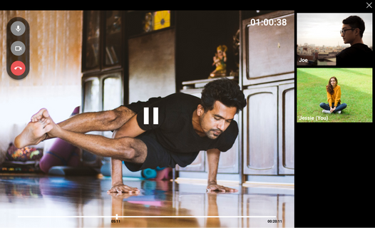
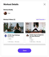
Easily join an ongoing workout session, preview tutorials, and adjust video and audio settings.

Workout Tutorials
On the Tutorials page, users can access workout tutorial videos that are recommended based on their skills, goals, and preferences. Users can also search for any videos within the system database. They can save these videos to curate their personal watchlists.

Progress Tracker
View progress and consistency streaks that motivate you to keep going. View total workout duration, workout types, and workout buddies.

Schedule Workouts
View personal or group workout sessions. Schedule new sessions for yourself, or send invites to friends for a group workout.

OUR APPROACH

RESEARCH
The research encompassed three main phases. In the D1: Understand the Problem phase, we approached with divergent thinking to understand the problem space. We analyzed tasks (user tasks and task environment), existing systems, and contexts (sociocultural and physical). These methods let us identify gaps and areas to converge in the next phase.
In the D2: Define phase, we did requirements gathering, established system requirements, and developed design alternatives. We conducted semi-structured interviews, user feedback sessions, and analyzed our findings into affinity maps and hierarchical task analysis.
In our D4: Discount Evaluation phase, due to time & resource constraints, we conducted usability tests and digital survey on a small sample size (4 users). We analyzed our findings using a scaled down affinity map and qualitative analysis for the survey.
D1: UNDERSTAND THE PROBLEM


Task Analysis: user tasks & task environment
Key findings in analyzing likely user tasks & task environment included:
Task
requires scheduling between two or more parties or spontaneous linking up
users of varied ability, potentially doing difficult exercises together
Task environment
target users live in parents’ house, spouse/partner, or roommates
This method highlighted key factors such as envisioning the indoor setting and physical settings (need handsfree while working out) as users use our system.
Analysis of existing systems
We saw a spike in video conferencing software during the pandemic, and interpreted increased user familiarity with these tech types. Yet, current systems like Zoom, Skype, and others, were not designed for remote workouts. Users combined these platforms with third-party workout platforms in order to workout with friends.
Workout apps like Nike train, Zombies! Run, and Couch to 5K, let users to workout alone or with friends, but lacked the video conferencing features for synchronous group workouts.


Analysis of sociocultural & physical contexts
Our research showed that younger adults faced multiple barriers to exercise including social barriers, family responsibilities, and career commitments. This finding directed our focus towards solutions to encourage consistent workout and increased social support. Additionally, the varied user skills and equipment access directed our focus towards bodyweight fitness that requires minimal exercise equipment.
Design implications
From our findings, we concluded 13 design implications (which were open to change). These included:
Design should be simple enough that even physically exhausted users can still use it. The interface should ideally be robust to imprecise, trembling limbs, and people out of breath
Feature that allows scheduling and planning
Design should accommodate for users’ typical physical space
Interactive to mobile / tablet / desktop
D2: DEFINE


Semi-structured interviews
Findings highlights related to our users’ motivations and pain points:
users were more consistent when exercising with friends than alone due to accountability and the excitement of seeing friends
users worked more intensely due to social support and friendly competition
users struggle to find a good time for entire group
users have varied equipment
Affinity map
We analyzed our interview findings using affinity mapping to uncover user behaviors, attitudes, pain points, and wants.


Hierarchical task analysis
We conducted hierarchical task analyses on
scheduling a workout session with friends, and
participating in a synchronous workout with a friend over video conferencing
We used this method to understand current user flows, expectations, and mental framework.
10 Sketched concepts: User feedback
We presented 10 design concepts to users in one-on-one feedback sessions. We used this method to engage our target users and stakeholders in our design process, as well as identify what specific aspects of our ideas suited users' needs and overall preferences. 2 key insights included:
Users get hyped for gamification; a gamified, ‘choose your own adventure’ concept gained the highest user ratings with user feedback that the concept seemed “fun and motivating”
Users were conflicted on competition; for a concept involving splitting groups to compete, some users thought it can be motivating, but others felt it was off-putting to have winners and losers


10 Sketched concepts: Analysis
Based on the user feedback sessions, we consolidated the feedback and ranked the concepts based on user ratings and feedback. Finally, we analyzed the concepts with a decision matrix based on novelty, feasibility and user affinity to pick our top concepts: video calls + workout tutorials and spontaneous or planned workout with friends, to move forward in the project.
Storyboard
With the design concepts identified, we storyboarded the user flows for key features to envision an ideal user flow. We based our vision on previous research findings to ensure we accounted for user pain points, needs, and system requirements.
D3: PROTOTYPE DESIGN
Based on our research findings, we updated our system’s functional and non-functional requirements to guide our prototype design. The updated requirements included:
Functional
supports asynchronous workout, but highly encourage synchronous workout
promotes consistency of exercise through group socialization regarding exercise
facilitate remote synchronous workout
keeps track of user workout progress
Non-functional
Involves bodyweight workouts exclusively
Interface should be eminently observable/visible to focus the motivation towards specific action
Promote accessibility by accommodating different exercise needs
The vibe of the system should be friendly and inviting; exercise should feel rewarding and promote camaraderie
Next, we planned the user flows, tasks, and features. We then created wireframes, built the system visual design language, and finally, created the high-fidelity prototype.
 |  |  |
|---|---|---|
 |  |  |
PROTOTYPE DESIGN
D4: DISCOUNT EVALUATION


Usability evaluation
Due to time and resource constraints, we conducted task-based think-alouds with four one-to-one sessions to gauge the system usability and clarity. We used Figma and Microsoft Teams. Users particularly loved the workout tutorial recommendations and ability to video call friends to workout.
Critical feedback are below in Affinity Map.
Digital survey
We deployed a short digital survey using Google Forms to our prototype evaluators to gauge their first impressions and user experience. We did this by using a combination of short answer and System Usability Likert scale type questions.


Affinity map
From our usability evaluations, we organized our user comments and insights into groups or themes to identify wins, gaps, and issues to work on. We found 10 total issues to look into. Key ones included:
1. Lack of menu clarity:
Several users were unsure what the time stamp next to friends’ names implied; “I don't know if it's 12 mins into [the session] or 12 mins remaining.”
Uncertainty what the workout type e.g. “cardio” next to friends’ names implied - is this their interest? What they are currently doing? “It says ‘cardio’ on his name, so I’m thinking he’s strictly interested in doing that only.”
2. UX writing:
“Ping” term: “I don't know what "Ping" means here. Maybe it means message? It meant ‘invite’.”
“Tutorial” term: User thought it was system tutorial and not workout tutorials
Data analysis
From the Digital survey, we uncovered data on the system's usefulness, relevance, usability, and the users' affective experience. Overall, our data analyses showed that participants found the usability and learnability of the system positive, but more work needed to be done to make exercise feel rewarding (one of our requirements). E.g. The statement: “This platform makes me feel that exercise is rewarding”, the 4 participants respectively rated a 1,2,3, and 5 on the Likert Scale with 1= strongly disagree, 5= strongly agree.
Due to the small sample size, we were careful to treat the data as more qualitative than quantitative.
HIGH-FIDELITY SCREENS
REFLECTIONS
Iterate, test, iterate, test
Trusting this method helped us avoid perfectionism paralysis and instead, embrace imperfection to continuously polish our system as much as we could in the time given.
Time constraints? No problem
Given time constraints, we learned that some user insights were better than none. We tested early concepts and prototype with a smaller user sample size and received insightful feedback that helped us refine the system. This was more valuable than us speculating within the team to make design changes without any user-based evidence.


